1. SPECIES IN PIECES
It is an interactive web
exhibition on the 30 animals we are in danger of losing.
This website enables you
to scroll through each of the unique species and click to discover their main
threats and see their population stats visualized on polar charts.
2. NOTORIOUS BOND
notoriousbond.info is
interactive infographics. It is interactive exploration into the things each
actor was notorious for.
Such as the number of martinis consumed, the number of
times each actor was presumed dead and the number of people killed etc.
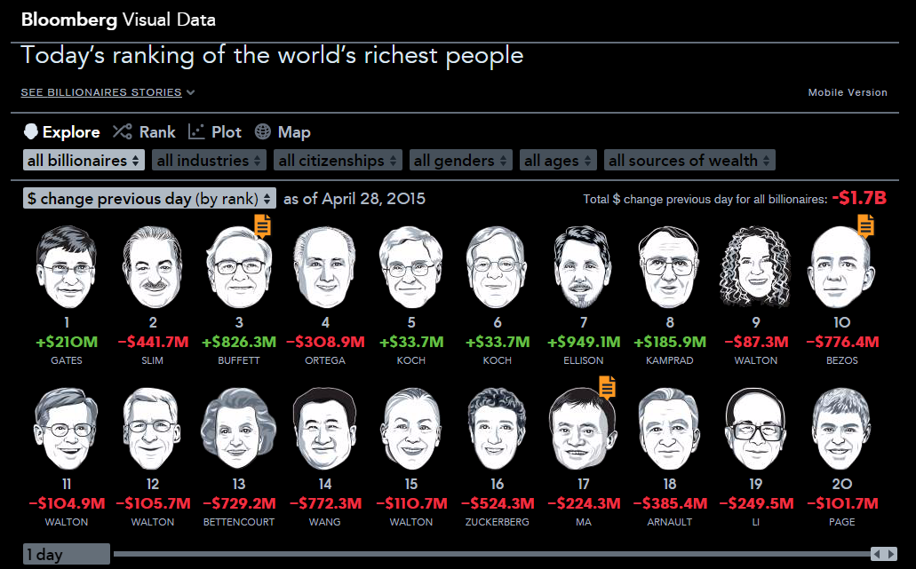
3. BLOOMBERG BILLIONAIRES INDEX
The Bloomberg
Billionaires Index visualizes a daily ranking of the world's richest people.
The index is a dynamic
measure of the top 100 billionaires based on changes in markets, the economy
and personal assets.
An interactive look at
time.
Listen to Wikipedia is a
visualization and sonification of Wikipedia's live recent changes data. The
sounds indicate addition to (bells) or subtraction from (strings) a Wikipedia
articles, and the pitch is inversely proportional to the size of the edit (a
lower pitch means a bigger edit). Green circles show edits from unregistered
contributors, and purple circles mark edits performed by automated bots. A
string swell welcomes a new user to the site. There's something reassuring
about knowing that every user makes a noise, every edit has a voice in the
roar.
A look at the world's
food right now, with a focus on how much we produce, consume and waste every
second.
7. Earthquakes
It is interactive
visualization of earthquakes happened in the past 24 hours. The data is fetched
from USGS.
8. Commonwealth War Dead: First World War Visualized
This website maps war dead recorded by the Commonwealth
War Graves Commission during the First World War.
9. Women in Science
It is centered on the
theme “Equality for women is progress for all” helps visualize the gender gaps
in the pipeline leading to a career in research.
10. Eyes in Space
Eyes in space.... take
every one on a personal journey to roam the cosmos.
An interactive look at
time.
Listen to Wikipedia is a
visualization and sonification of Wikipedia's live recent changes data. The
sounds indicate addition to (bells) or subtraction from (strings) a Wikipedia
articles, and the pitch is inversely proportional to the size of the edit (a
lower pitch means a bigger edit). Green circles show edits from unregistered
contributors, and purple circles mark edits performed by automated bots. A
string swell welcomes a new user to the site. There's something reassuring
about knowing that every user makes a noise, every edit has a voice in the
roar.
A look at the world's
food right now, with a focus on how much we produce, consume and waste every
second.
7. Earthquakes
8. Commonwealth War Dead: First World War Visualized
This website maps war dead recorded by the Commonwealth War Graves Commission during the First World War.
9. Women in Science
10. Eyes in Space
It is interactive
visualization of earthquakes happened in the past 24 hours. The data is fetched
from USGS.
This website maps war dead recorded by the Commonwealth War Graves Commission during the First World War.
9. Women in Science
It is centered on the
theme “Equality for women is progress for all” helps visualize the gender gaps
in the pipeline leading to a career in research.
Eyes in space.... take
every one on a personal journey to roam the cosmos.


0 comments:
Post a Comment